


THE DEEPTECH INVESTMENT ARCHITECTURE SERIES
Demand-Supply Resonance Map, Market Centricity Framework, & Portfolio Application
At pi Ventures, we invest in companies addressing global problems through 10x disruptive technology innovation. The central challenge: identifying them early enough to matter, but not so early that neither technology nor market is ready.
This document consolidates 2 interconnected frameworks for thesis building, deal evaluation, and portfolio tracking: the Demand & Supply Resonance Map, the Market Centricity Framework, and their longitudinal application to a portfolio company trajectory.
This is a 3-part series.
PART 1: DEMAND & SUPPLY RESONANCE MAP
The Framework: Position, Zones, and Practical Constraints
The Resonance Map is a two-axis grid for plotting startups, technologies, or market categories at a given point in time. Every position reveals timing risk and commercial viability.
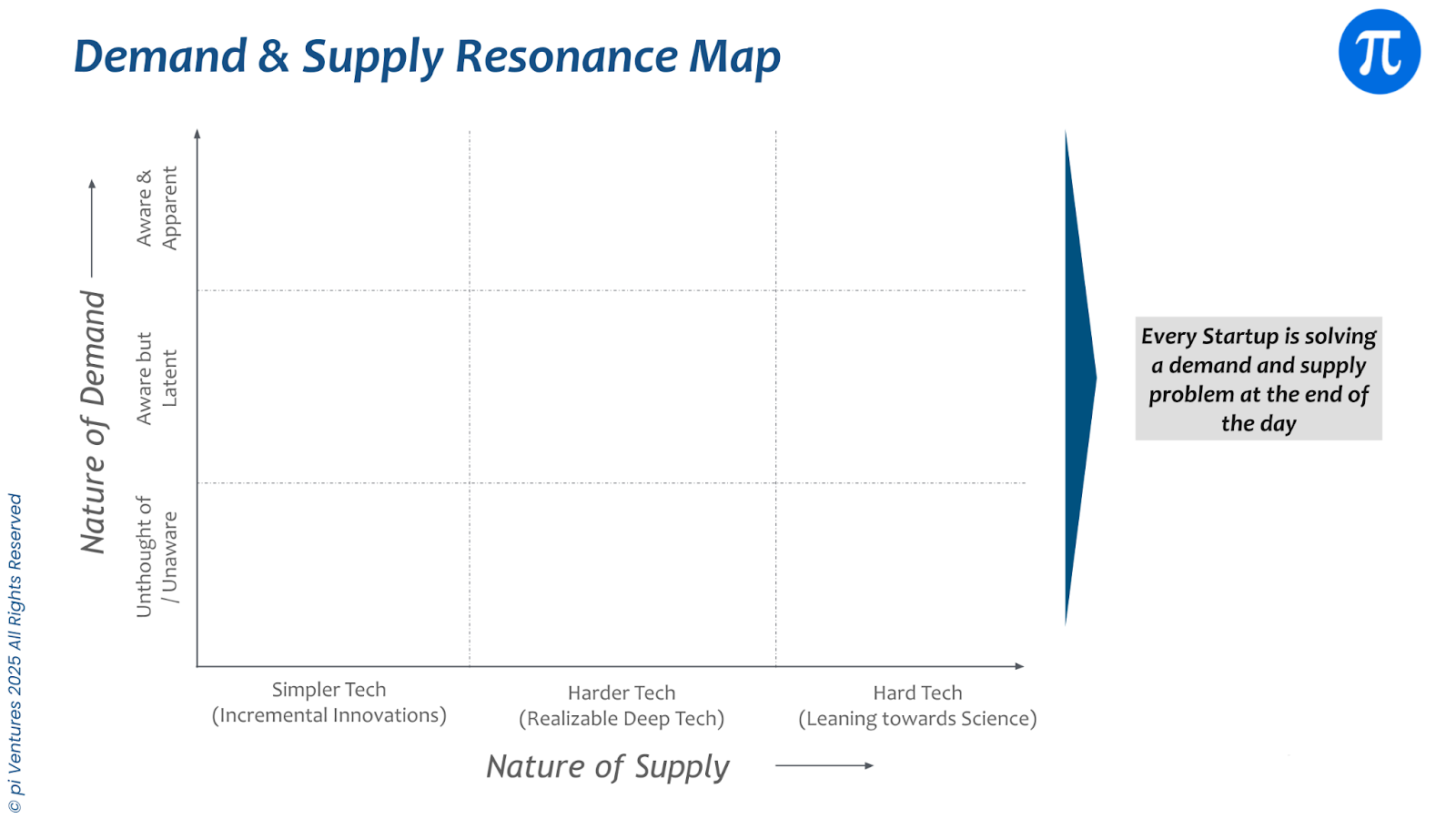
The Demand Axis (Vertical)
Market awareness and urgency for a solution:
- Apparent / Needed (top): Problem is well-understood and actively felt. Customers seek solutions today. Example: EV charging infrastructure as EV adoption scales.
- Latent (middle): Problem exists but not yet articulated or actively sought. Buyers may not recognize it as solvable. Example: personalised nutrition in 2010.
- Unaware (bottom): Demand is entirely unexpressed. Will only emerge once a product demonstrates new possibilities. Example: streaming music before Spotify.
The Supply Axis (Horizontal)
Technical difficulty and solution maturity:
- Simpler Tech / Incremental (left): Well-understood, widely available, relatively cheap. Moat from execution, distribution, or brand, not technology. Example: most SaaS tools.
- Harder Tech / Realizable DeepTech (middle): Meaningfully difficult, requires specialised expertise, provides genuine differentiation but achievable within a reasonable timeline. Example: applied AI/ML systems, advanced materials.
- Hard Tech / Leaning Toward Science (right): Pushes boundaries of what is possible. Long lead times, significant capital, uncertain timelines. Example: fusion energy, AGI.
The Five Zones
The grid creates five distinct investment territories, each with different risk profiles and strategic implications.
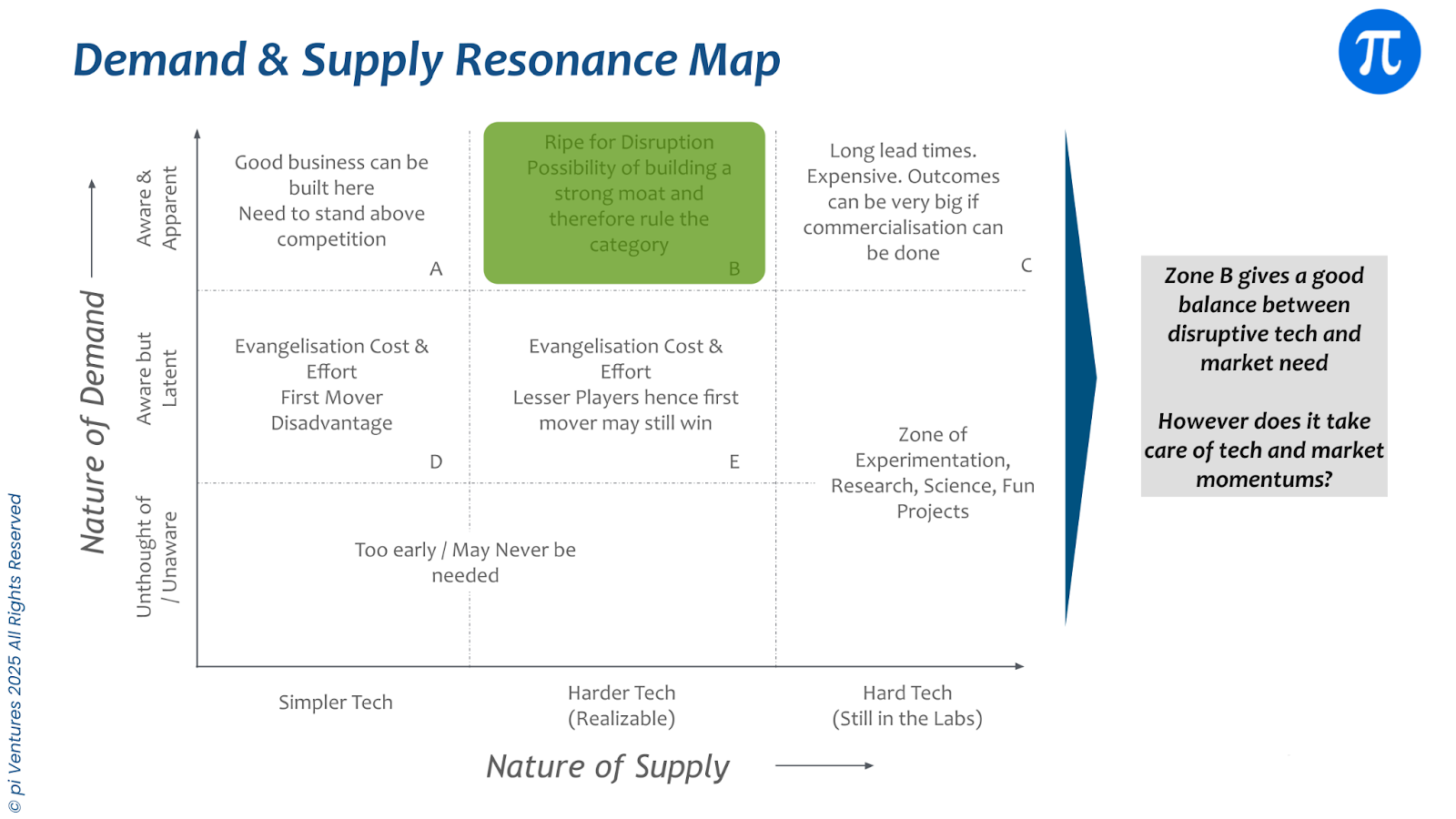
Zone A (High Demand, Simple Tech): High volume, low barrier to entry. Risk is execution and competition density. Short commercial cycles.
Zone B (High Demand, Realizable Tech): The primary target for venture-backed deeptech. Demand proven, technology moat defensible, path to scale realistic. 3-7 year timeline to meaningful revenue.
Zone C (High Demand, Hard Tech): Binary outcomes, uncertain timelines. Fundable when roadmap to Zone B is credible within fund horizon or when demand is structurally locked (defence contracts, government mandates).
Zone D (Latent Demand, Hard Tech): Emerging category with uncertain path to viability. Only viable for well-resourced teams with rare expertise. High dilution risk.
Zone E (Unaware Demand, Hard Tech): Almost always too early for commercial investment. Exception: rare team with irreplaceable expertise, plausible 5-8 year pathway to Zone B, fund capacity for patient capital.
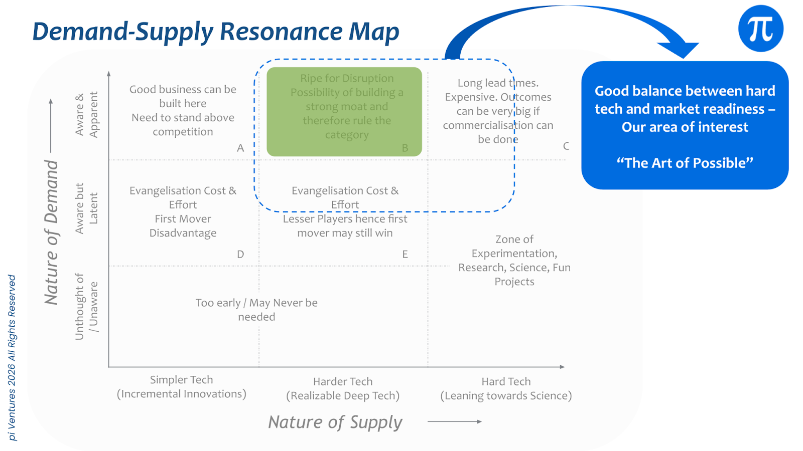
Note: Zones D and E can be broadly considered as "Zone of Experimentation, Research, Science, Fun Projects" kind of work and most startups/theses in these zones may not be venture investible, yet. Grants might be a better fit for startups in these zones.
Illustrative Trajectory: Autonomous Warehouse Robots

In 2020, autonomous warehouse robots sat in a high demand but constrained supply position. E commerce growth created visible urgency, but technical reliability, navigation accuracy, and integration complexity kept supply tight. The thesis relied on demand tailwinds and gradual technical maturation.
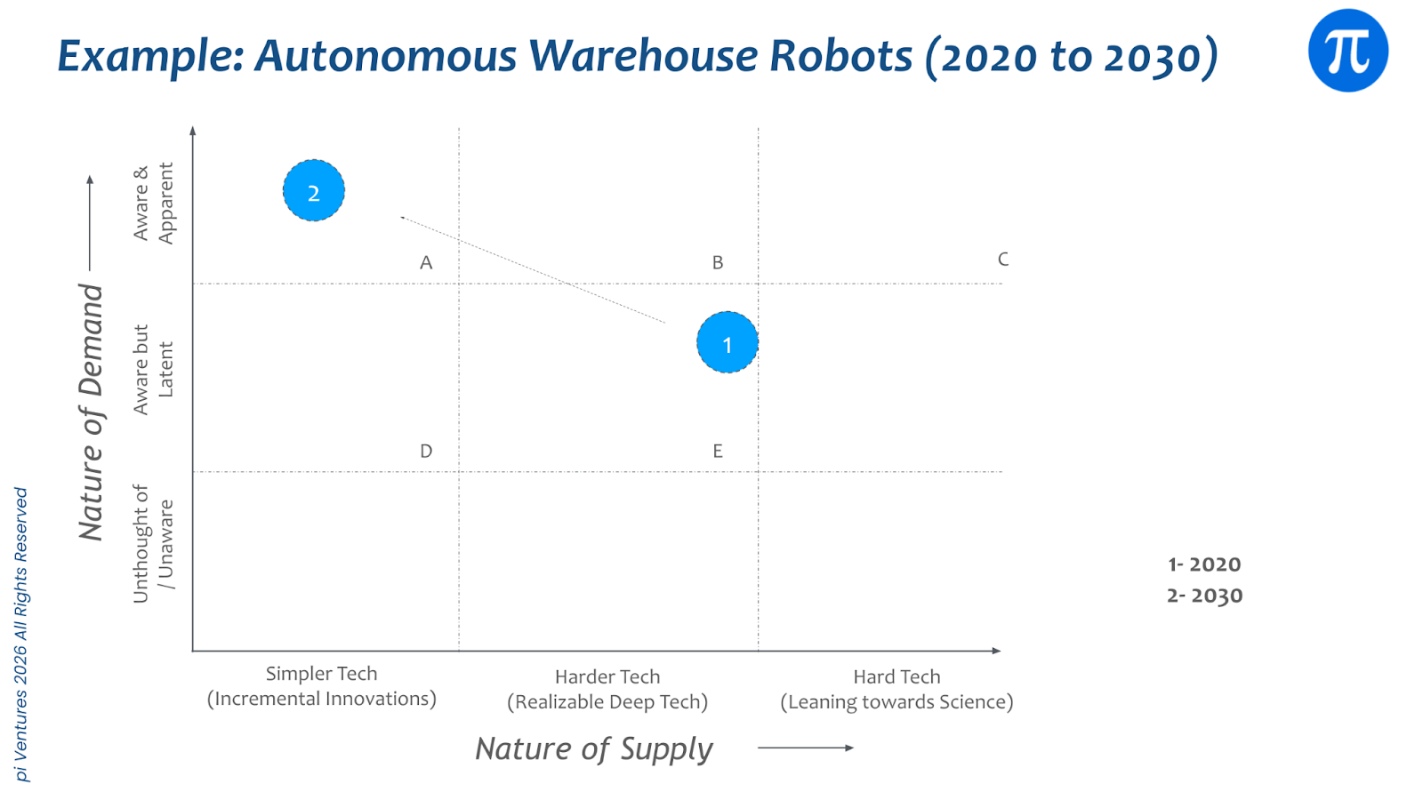
By 2030, the same category shifts rightward and slightly upward. Technology becomes more reliable and modular. Deployment cycles shorten. Supply increases, competition intensifies, and differentiation moves from core robotics to fleet intelligence, software orchestration, and unit economics.
The insight:
- The map is not static. It forces clarity on what must improve for the position to strengthen.
- As ecosystems mature, durable value is created when technology becomes easier to deploy while demand strengthens. The startup should, ideally, move diagonally toward simpler supply (ie reliable tech) and stronger demand. ie overall move should be towards top left.
- Single axis progress creates friction. Diagonal movement compounds the advantage.
- If movement happens only on the supply axis, technology improves but demand does not materially expand. Fancy and reliable tech but no ROI.
- If movement happens only on the demand axis, urgency rises but supply remains constrained or immature. Buyers ready but Technology not production ready.
What the Map Does Not Tell You
- Team quality: Two startups in identical positions can have wildly different outcomes.
- Competitive density: Market with 40 funded competitors is different from one with three.
- Capital efficiency: One startup may need $500M to reach Zone B, another $15M.
- Subjective margins: Experienced investors often disagree on zone placement. That disagreement forces explicit thesis reasoning.
Using the Map for Thesis creation / Startup Analysis
The Five-Year Projection Method: plot current position, then project position in five years under assumptions. The gap defines the thesis and the risks to it. Some questions to ask / discuss internally with the team:
- Supply axis: What enables this technology to move leftward (become easier to build)? Does easier build mean more competition or faster scaling with compounding head start?
- Demand axis: What catalysts shift awareness upward (policy, cost parity, culture, adjacent tech)? What could suppress demand (incumbent resistance, competing solution)?
- Zone B arrival: What combination of supply and demand defines Zone B? What is probability-weighted timeline?
Advanced Variants: Trajectory and Multi-Market
Progression Curve: Plot annual position over time (ex: wrt years, not wrt milestones) to reveal velocity. Slow years show short distances between dots; acceleration years show longer jumps. Stalled sectors demand thesis re-examination.
Demand-First vs. Tech-First: Tech-First (leftward then upward) carries demand-axis risk. Demand-First (upward then leftward) carries supply-axis risk. Ideal: diagonal movement toward Zone B with both axes moving simultaneously.
Multi-Market Mapping: Many platforms apply across multiple verticals. Plot separate maps for each market. The beachhead segment should receive commercial energy; others inform the expansion roadmap.